Use basic widgets to build your site's foundation. These tools allow you to add essential elements like text, buttons, and navigation aids to help visitors find information and take action.
Use the Text or Title widget to create headlines, share information and tell visitors about your site. There are three text widgets available: Text, Large title (H1), and Small title (H3).
Click the widget to open the inline bar to style text as follows:
- Use the AI Assistant to generate or edit content.
- Apply a font family and font styles, such as bold, italics, or underline to your text.
- Add or change hyperlinks.
- Create numbered or bulleted lists.
- Connect data.
Alternatively, assign special styles in the site theme to manage your design globally.
Drive visitor action by adding buttons. Links can lead to pages, store items, popups, anchors, or downloadable files.
Click the widget and select the Content tab to make the following actions:
- Under "Text on button", enter the relevant text for the button.
- Select the link destination.
- Use the "Links audit tool" to ensure your button links to the expected location.
Click the widget and select the Design tab.
Note:
Changes made in the Design editor override styles set at the theme button level. To revert back to the theme button style, click Reset to theme style.
- Choose between primary or secondary theme styles and style accordingly.
-
Toggle on Floating to keep a button visible when visitors scroll.
Use Floating buttons to keep important calls to action fixed, visible, and clickable on all site pages. Ideal uses cases include:
- Contact Us
- Subscribe
- Get a Quote
Toggle on Show on this page only if required.
- On mobile, we suggest placing the Floating button at the bottom corner of the screen so visitors can easily click it with one hand.
- You can display an icon rather than text on mobile by choosing the layout that features an icon on mobile.
- If a floating button is not displaying on mobile, you may be using an old mobile layout. To update the layout, go to the Design Editor, and click Site Layout.
Use the Spacer widget to create a professional, organized layout and improve readability by adding vertical blank space between widgets.
Click the widget to change the height of the widget.
Provide flyers, ebooks, or documents for download. Site visitors can share your download links through other sources, such as email and social media.
Before you begin
- You can't upload files to your root folder.
- Uploaded files are public. Only upload files you own or have permission to use. Don't share confidential data.
- Supported formats include
.pdf, .xls, .xlsx, .doc, .docx, .zip, .ppt, .pptx, .psd, .txt, .xml, .mp3, .ttf, .otf, .woff, .eot, .svg, .odt, .ott, .js, .css, .png, .jpg, .gif, .jpeg, .rar - You can add up to 15k of files per site. File size limit is 200MB.
- Spaces within file names aren't supported.
- Click the widget, and select the Content tab.
- Under "Text on button", enter the button text in the field provided.
- Click + File to add a file.
-
To add new files, click + Upload Files.
Drag your files or click Choose files to add files or folders. Files can also be downloaded from Dropbox, Google Drive, a link, or Gmail. You can add multiple files to upload simultaneously.
- Select the relevant files and click Upload. You'll be notified when the upload is complete.
- Select the relevant file.
- Optional: Check the Set file to no index box to prevent search engines from displaying the file in search results.
- Click Done.
Organize information using pre-formatted list layouts.
For more complex lists consider using the Restaurant menu widget.
- Click the widget and select the Content tab.
- Choose to include an Image element and Link element associated with each item on your list.
- Click Build your list to add content.
- Click a list item to open the "List settings". You have the following options:
- Click + Image. to add an image.
- Under "Item label", enter the required label text. To hide the label, click
 .
. - Under "Description", enter the required description text. To hide the description, click .
- Click Add link to select the type of link you want to add to the item.
- Under "Text on link", enter the required link text. To hide the description, click .
- Click + Add Item to add additional items to the list.
- Under "Main list title" enter the list title in the field provided.
- Clickand drag an item to reorder it.
Click the widget and select the Design tab to style the widget, including the layout, font styles, rounded image edges, and divider styles.
Use the Column widget to organize and arrange content within a row.
When you select a column layout, a horizontal row is automatically created to hold the vertical column content.
Important:
Create a backup of your site before editing columns to ensure you can restore a previous version if needed.
- Right-click the widget to open the column editor menu.
- If the column has no padding, right-click the widget inside the column
- Click Select container.
- Select Column.
- Verify the menu header displays "Column".
- Edit each column individually as follows:
-
Position
To change the column's position, click the arrows to the right or left.
The arrows are disabled if the row contains only one column.
-
Add
Click + Add and select one of the following:
- Column. Add a new column to the current row. A max of 4 columns can be added per row.
- Inner row. Add a row within the current column.
- Widget below. Add a new widget directly under the current one. You can choose from the following: Text, Image, Button, Icon, or select More widgets to open the full widget library.
-
Padding
To remove inner spacing, click Clear Padding
-
Revert
To revert to theme settings, click Reset to default spacing.
-
Animation
Click Animation and select an animation style, such as a fade or zoom, to apply to the column.
-
Hide
To hide the column on desktop, tablet, or mobile views, click Hide from and select the relevant option.
-
Copy
To copy the column, click Copy.
-
Anchor
- To anchor the column to the page, click Set as anchor and enter a name. Check the box to add the anchor to your site's navigation
- To edit the name of an existing anchor, click Edit anchor. Enter the name and click Update.
- To delete an existing anchor, click Edit anchor. Click Delete anchor.
-
Connect data
- To connect data, click Connect Data. Under the "Connect" tab, select the relevant option and click Connect.
- To change the connected data, click Connect Data. Select Change connection. Make the required changes and click Connect.
- To edit connected data, click Connect Data. Select Edit content. Make the required changes and click Save.
-
- To delete the column, select the column and click Delete.
To edit the background style or spacing of a column:
- Click the widget.
- In the Design editor, choose a background type:
-
Color:
- Select a solid color or gradient. Gradient colors override images and vice versa.
- Style the border color, width, and radius.
- Toggle on Shadow, and select a color, type, and position.
-
Image:
- To add an image to the background, click + to open the image picker.
- Select the relevant image.
- To create a background image slider, select multiple images from the image picker.
- Click Done.
- Choose your image display: Cover, Full image, Tile, or No repeat.
- Configure the position, background overlay, border, and shadow for the image.
- To add an image to the background, click + to open the image picker.
-
Video:
- Click Select video to select an uploaded file, or paste a URL from YouTube, Vimeo, or Dailymotion.
- For more information about video backgrounds, see Video Backgrounds.
-
Color:
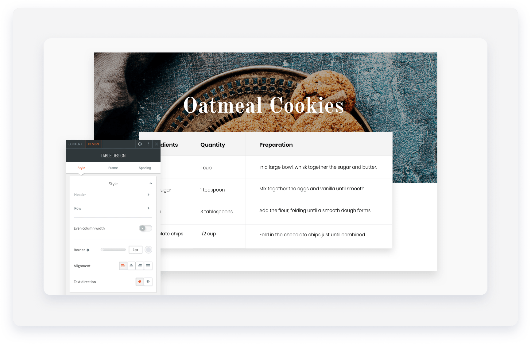
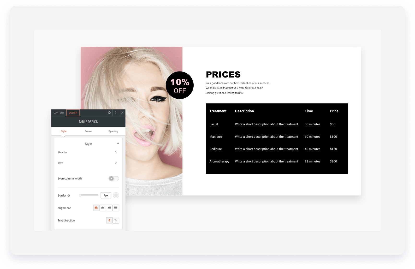
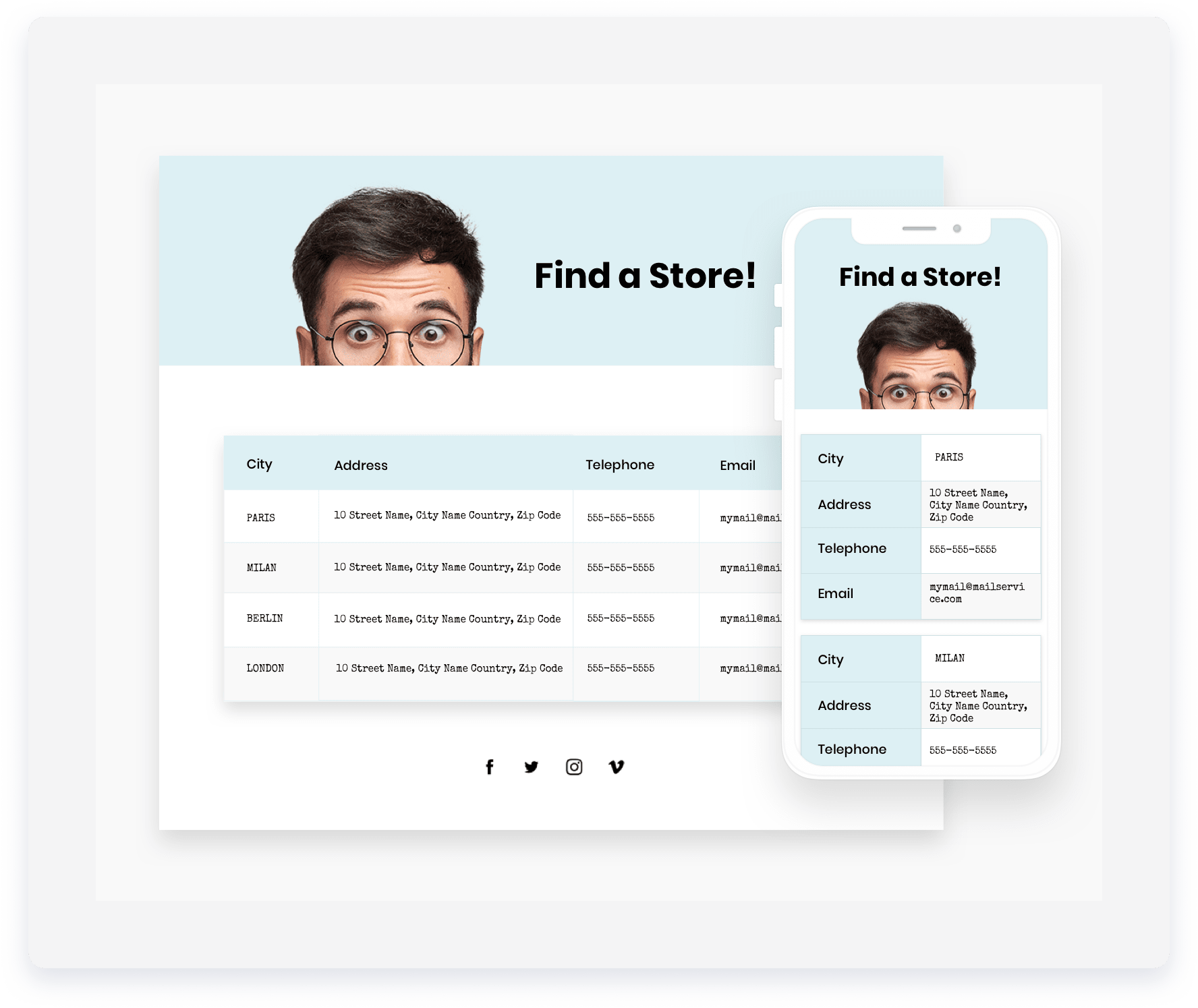
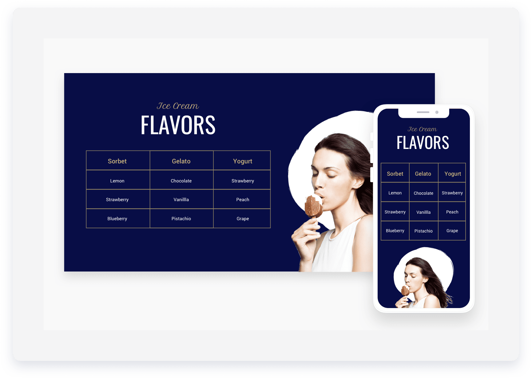
Display data in rows and columns. You can type data directly, paste an existing table, or upload a CSV.
Before you begin
- Upload a CSV exported and copied from Google Sheets or Excel (non-RTL languages only).
- Tables can only include text and links. Use rows and columns or the List widgets to create a table with images, buttons or other widgets.
- The Table editor isn't supported on Edge version 17.
- The table can include up to 30 rows and columns.
- When connected to data, the row limit is the collection type's limit:
In the Content tab, type directly in the editor or click Upload a CSV to add data to the table.

Use Clear All to clear all data from your table.
Click the widget and select the Design tab to adjust row colors and column widths.
On mobile, choose between Squish, Scroll, or Collapse displays.
The Table widget syncs data from internal or external sources like Google Sheets and Airtable, allowing you to manage content outside the editor. It automatically links rows to any existing dynamic pages in the same collection for easy navigation.
Connected tables support the following field types:
- Rich text
- Plain text
- Image
- Link
- Number
- Date and time
- Multi-select
- Phone
Connect table widget to a collection
- Right-click the Table widget and click Connect to data.
- In the "Connect" tab, select a collection from the dropdown menu.
- Select the required fields from the Fields to display options. The columns will be ordered in the same order they are selected.
- Click Connect.
- A successful data connection is marked with
 when you hover over the Table widge.
Ingredients list
Price list
Locations list
Flavors list
 .
.
Help visitors navigate your site hierarchy. Breadcrumbs show the path to the current page, which improves both user experience and SEO.
- Click the widget and select the Content tab.
- Toggle on or off the items you want visible on the breadcrumbs. You have the following options:
- Homepage. Always show the home page in the breadcrumbs.
- Current page. Show the current page in the breadcrumbs.
- Hide the breadcrumbs when there isn't a parent page. Enables breadcrumbs for all pages except the homepage or pages on the first level of navigation.
Click the widget and select the Design tab to style the font, and select a divider style to separate page names.
Organize content into expandable sections like FAQs or product highlights. This reduces scrolling and helps visitors find information quickly.
The Accordion widget can display dynamic pages as well as specific collection or product information using inline binding.
- Click the widget and select the Content tab.
- Add or modify the fields:
-
Items:
- Click an item to edit its content
- To duplicate an item, click
 to duplicate an item
 - To add a new item, click + Add Item.
-
Display Rules:
- Toggle on Show one expanded item at a time to allow multiple items to be opened at once.
- Toggle on Show first item expanded to expand the first item in the list.
- SEO: Toggle on Enable FAQ schema to help search engines preview your content.
-
Items:
Click the widget and select the Design tab to style the widget.
Use H3 tags for SEO and optimize spacing for mobile devices.
Display related content like services or plans in compact sections. Visitors click between tabs to see different information without leaving the area.
Note:
You can have an unlimited number of tabs, however, tab labels shrink as more are added to provide room for the new tabs.
- Click the widget and select the Content tab.
- Click a tab to edit it. You can edit the image, image alt text, tab label, label heading type, title, description, button and button link
- To add a new tab, click + Add tab.
- To show the image, toggle on Show image.
- Click on the widget and select the Design tab.
- Click the layout thumbnail to select a layout.
- Click All tabs to customize the style of the tabs.
- Click Selected tab & hover to customize the text style and background. This does not affect the "All tabs" design.
- Apply additional styling to the following:
- Description style
- Button style
- Image style
- Frame style
Embed a search widget that allows guests to select stay dates. Once a guest choose their desired dates, the vistor is redirected to your Guesty Booking Engine to pick a property.
The destination filter automatically pulls data from your listings' "City address" fields. You can customize these values to display neighborhoods or regions instead of cities, however this may affect channel connections with platforms like Airbnb, Booking.com and Vrbo due to their address requirements.
By default, the Booking Engine widget is embedded into your homepage when you start creating your Guesty Website.
- Click the widget and select the Content editor.
- Optional: Select the location for properties you want to display from the dropdown menu.
- Optional: Select your check-in and check-out dates
Click the widget and select the Design editor to style the button.
Add a copyright disclaimer that automatically updates to the current year. This shows visitors that your site is active and up to date.
- Click the widget and select the Content tab.
- Under "Description" enter your disclaimer text in the text field provided.
-
Toggle on Reverse icon/year position if needed.
The copyright widget displays on every page of your site.
Click the widget and select the Design tab to edit the font, color, and alignment of the text.
Tip:
Drag the widget into the desired position. Standard placement is at the very bottom of a site.
Showcase specific properties based on criteria like location or amenities. Use this widget on landing pages to improve your ranking in Google search results.
Add engaging titles such as “Poolside apartments in Amsterdam” and offer filtering and sorting options to help visitors find their perfect property. When guests search online for poolside apartments in Amsterdam, they’re more likely to reach your page and book through your website. Create as many targeted landing pages as you need so your properties are easy to find.
When a visitor clicks a property in the widget, they are redirected to your Guesty Booking Engine to start booking. When they filter or sort results, they see only listings that match their selection.
For the most effective landing page, combine the following widgets:
- Booking Search Bar widget – add a search bar at the top so guests can easily start a reservation. Prepopulate the location and other fields to match the page’s focus (e.g., set location to “Amsterdam” on your poolside apartments page).
- Featured Properties widget – place this below the search bar to highlight your best properties. Learn how.
- SEO Search Results widget – add your main title (like “Poolside apartments in Amsterdam”) and display your full listing selection with search and filter options.
Add the SEO search result widget to a dedicated landing page with a clear URL, or to your home page. Alternatively, you can add the SEO search results widget to any page without combining it with other widgets. Just drag and drop the widget wherever you want.
- Click the widget and select the Content tab.
- Under "Properties to display to guests when they first land on this page", select the relevant location from the dropdown menu.
- Under "Listings tags (categories)", select the relevant category tags.
- Select the number of bedroom and bathrooms, and enter the listing's nightly rate.
- Select one of the following display options:
- Price - low to high
- New to old
- Old to new
- Under "Enable guests to filter and sort", toggle on the required filter options:
- Enable filters for guests
- Enable sorting for guests
- Click Apply.
Click the widget and select the Design tab to add animation and spacing to the widget.
Check Show "view more" button to enable visitors to see more properties.
Highlight top-performing or luxury listings using the Properties widget. This is ideal for landing pages where you want specific properties to stand out. You can drag and drop the widget anywhere on your website or on a dedicated landing page.
- Click the widget and select the Content tab.
- Search for and select the properties you want to showcase.
- You can choose up to 30 properties per widget.
- The listings status must be "Listed".
- Click + Add filter to refine results by amenities, property type and/or location.
- In the "Selected" tab, you can drag the properties to change the display order.
-
Click Save.
Tip:
You can add multiple properties widgets and set up different groups of featured properties to present on each.
Add images with wrapped text. The text automatically flows around the image according to the image placement.
Note:
Right-click and select Connect to Data to use dynamic content.
- Click the widget and select the Content tab.
- Select the image position: left or right.
- Click the image thumbnail to select an image.
- To add a link , click Link image and select the relevant link location.
- Under "Alt text", enter the required text if the filed provided.
- Under "Paragraph", enter your desired text.
Click the widget and select the Design tab to adjust the font and image properties.
Add a real-time countdown to your site to boost engagement and create urgency by highlighting limited time remaining for sales, events, and promotions.
- Click the widget and select the Content tab.
- Set the date the countdown ends in the field provided.
- Set the time the countdown ends in the field provided. Enter a specific time, for example, 11:45 pm if required.
- Select a timezone from the dropdown menu.
- Under "Time's up message", enter the message that appears when the countdown ends in the text field.
- Select Show counter at 0000 and message beneath it or Remove counter and display message only.
- Under "Title" enter the required text for the countdown in the field provided. To hide the title, click .