Flex sections are rows with two default flex columns that create a basic layout. Once you add a section, you can add, remove, or rearrange additional columns, flexboxes, or advanced grids to create your desired layout. Then you can add widgets to that layout.
Note:
This article is only relevant for users who started using Flex after July 18, 2022. If you are on Flex version 1.0, see Add and edit Flex sections (1.0)
Add section
To add a section:
- Sign in to your Guesty account.
- In the top navigation bar, click the mode selector and select Growth mode.
- Click Distribution.
- Click the Guesty Websites thumbnail.
- To the right of the relevant website, click Edit.
- Hover between rows, and click +Add Section. Or, right click to open the context menu, click Add, then select Flex section.
- In the side panel, click Flex Sections.
- Select the desired flex section.
- Click Save.
Note:
Save section
To save a section:
- Hover over the desired section and click Flex Section in the upper left corner of the section.
- Click Save as Section, then click Select only this row.
- Type a section name, select the category the section will be saved under, and select the permissions for the section.
- Click Start Creating.
- Click Done.
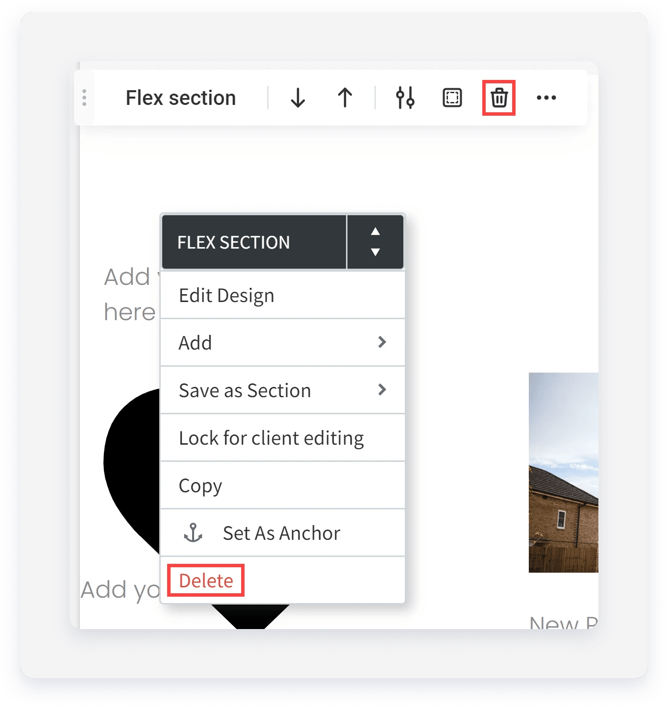
Delete section
To delete a section, right click to open the context menu and select Delete. Or, click the delete icon on the floating menu.
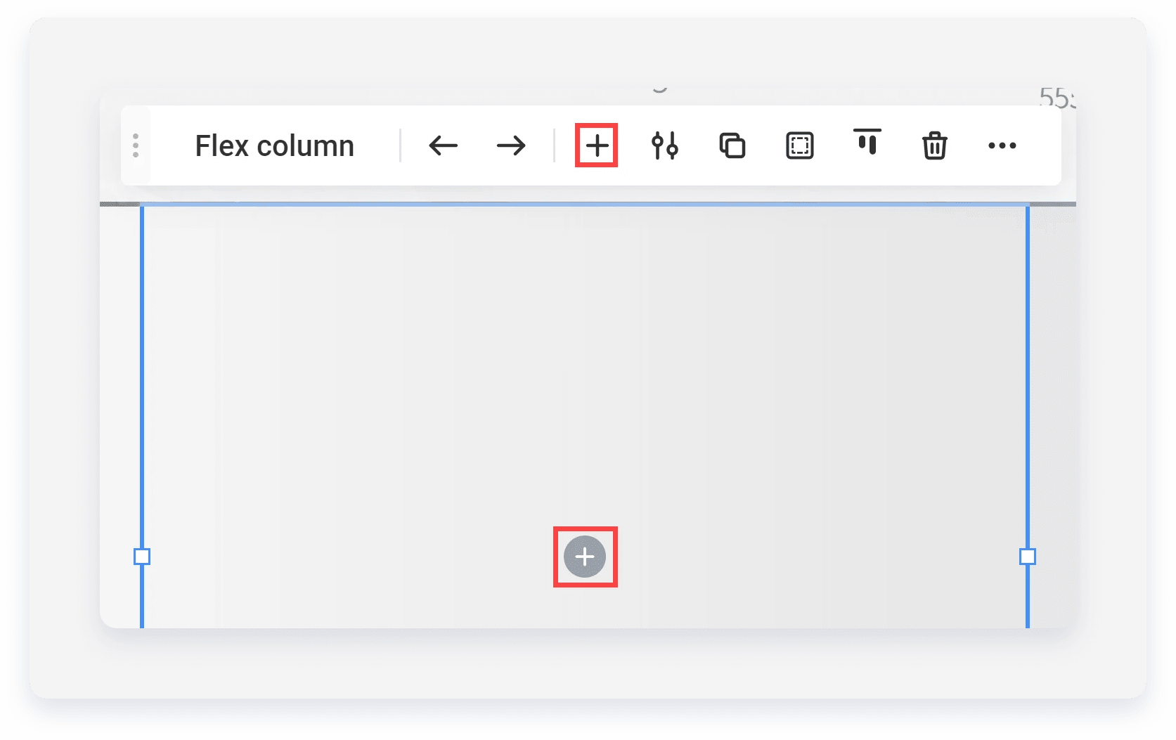
Add column
Once you’ve added a section to your site, you can add columns to contain widgets within the section. All sections contain columns by default, but you can still add additional columns.
Note:
When you add an element to a column, the position is determined by auto layout settings. To change the auto layout direction, open the design panel and in the Layout section, select horizontal or vertical for the auto layout.
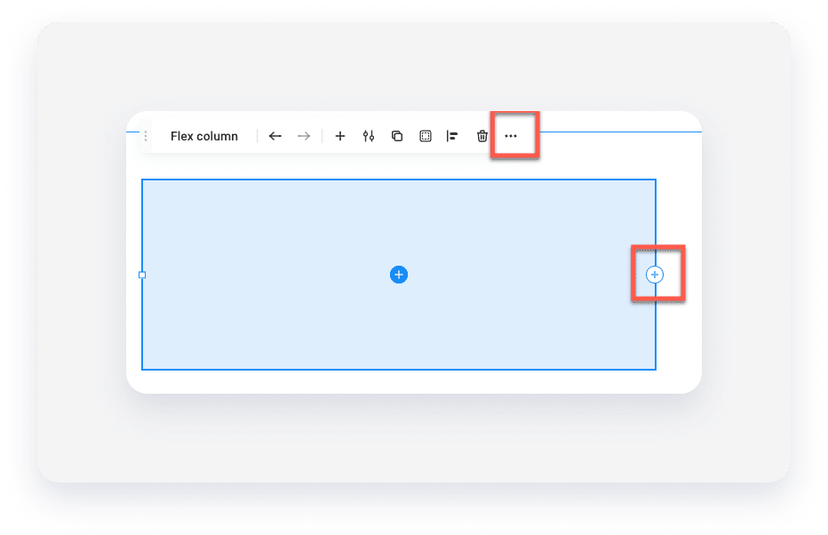
To add a column:
-
Click to select an existing column.
-
In the floating menu, click the three horizontal dots icon (
 ), then select Add column. Or, click the plus icon on either the left or right edge of the column.
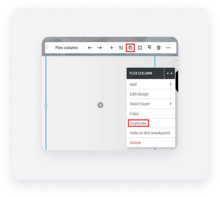
Duplicate column
You can duplicate a column and it will be added to the right of the original card. You cannot add columns that will exceed 100% of the width, including spacing.
To duplicate a column:
-
Click to select a column.
-
On the floating menu, click the Duplicate icon. Or, you can right click the column to open the context menu and select Duplicate.
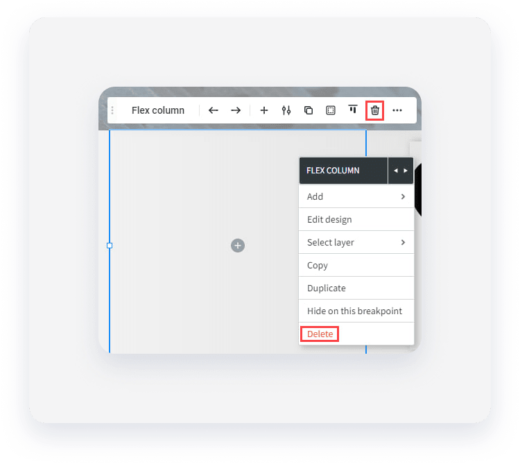
Delete column
You can delete a column to remove it from the section. However, each section must contain at least one column, meaning you cannot delete the last column from a section.
To delete a column:
-
Click to select the column.
-
In the floating menu, click the Delete icon. Or, you can right click the column to open the context menu and select Delete.
Add widget
You can add widgets to columns, flexboxes, or advanced grids in several different ways. If you are already in flex mode, you can add widgets directly from the side panel by clicking Widgets, then selecting the desired widget.
Note:
While in the classic editor, you cannot drag and drop a widget into a flex column from the side panel.
To add a widget:
-
- Click a column, flexbox or advanced grid to select it.
- Click the plus icon in the middle of the column, flexbox, or advanced grid. Or, click the plus icon in the floating menu.
- Select a widget.
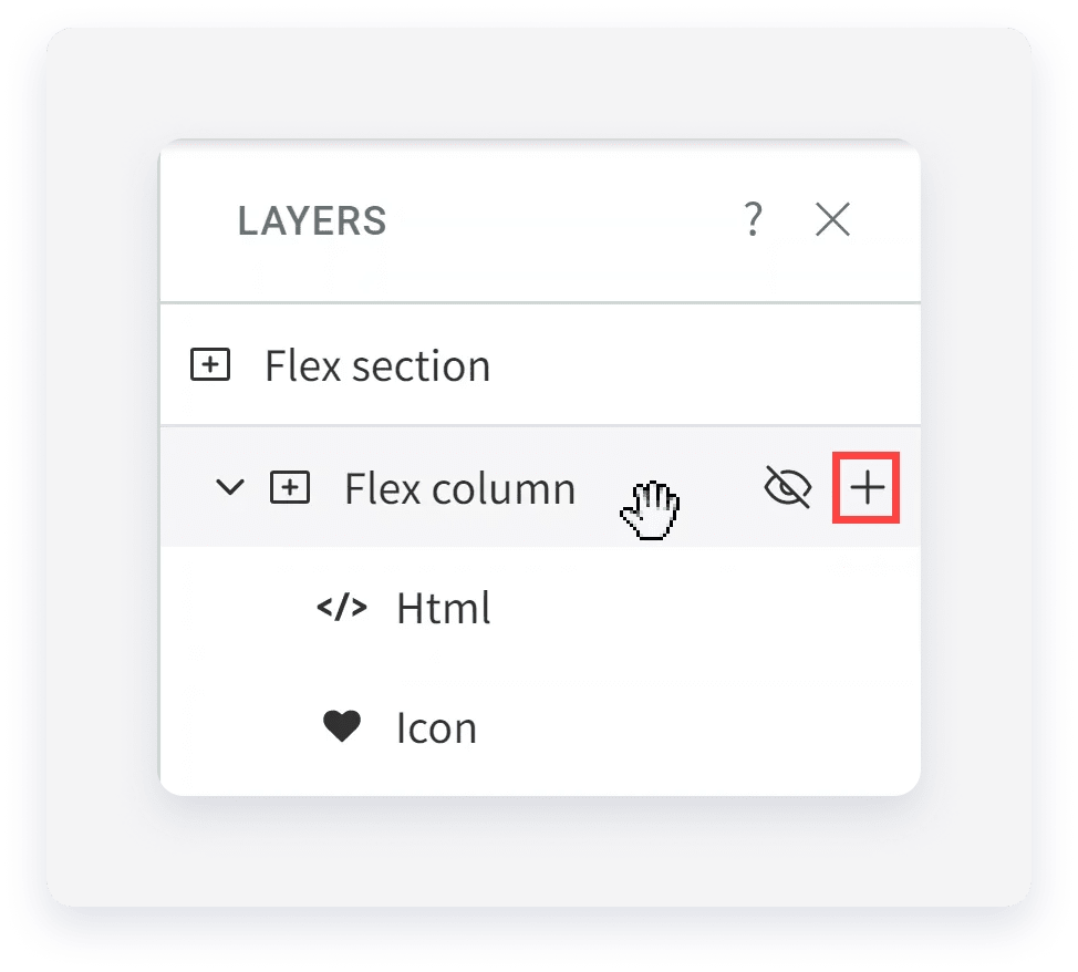
You can also add widgets from the layers panel.
To add a widget from the layers panel:
- Click to select a column.
- In the side panel, click Layers.
- In the layers panel, hover over the column, flexbox or advanced grid you want to add a widget to and click the plus icon.
- Select a widget.
CSS Classes for Flex Elements (Flex Mode)
In flex mode, you can add CSS classes to flex elements (section, column, inner column, and advanced grids). Using CSS classes can save time when styling elements. For example, instead of using the design panel to change a single column padding and size, you can create a CSS class and apply these style changes to any number of columns.
The same class can be applied to multiple elements on the same page, and multiple classes can be applied to the same element.
Note:
You must have access to developer mode to use this feature.
To add or edit a CSS class:
- Select the desired flex element (section, column, inner column, or advanced grid).
- Select Add CSS Class Name from either the floating menu or context menu,
- Type a new CSS class name or select an existing class name from the dropdown menu (You can select multiple classes).
- (Optional) If you have not already added the CSS class to the code, click open Dev mode.
- Click Done.