By using these different widgets, you can easily control the look of your site by configuring global design.
To add title widgets:
- Sign in to your Guesty account.
- In the top navigation bar, click the mode selector and select Growth mode.
- Click Distribution.
- Click the Guesty Websites thumbnail.
- To the right of the relevant website, click Edit.
- In the left panel, click Widgets.
- Click and drag the Large Title widget or Small Title widget into your site.
To learn more about adding widgets to your site, see Add Widgets.
Titles vs text
The most common question is which widgets should you use for your site? The answer depends on exactly what text you are creating.
- To create a headline or slogan that needs to stand out, use a Title widget. Title widgets can be assigned special styles in the global design section, so you can use them to really draw attention to certain parts of your site. You can have 6 assigned styles for titles. Keeping track of these will help you create your site faster by allowing you to make changes globally with the click of a button.
- To create a block of text, use a Text widget.
The Text widget has normal spacing and is suited to the normal text.
Titles have larger spacing. Use titles to draw attention to a part of your site.
Large and small titles
The large and small title widgets are essentially the same widget, but with different default settings.
- A large title widget inserts text with H1 styles applied by default.
- A small title widget inserts text with H3 styles applied by default.
Text options
Each text widget (text or title) comes with two adjustable options. One set can be adjusted inline while the other one opens a popup menu with additional options.
Inline options
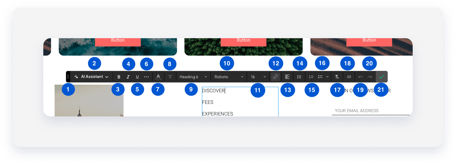
The inline options for text are:
|
Number
|
Option
|
Description
|
|---|---|---|
| 1 |
Move
|
Move the bar for easier editing (Changes UI only) |
| 2 |
AI Assistant
|
Use the AI Assistant button to generate titles, craft tailored paragraphs, and edit content. |
| 3 |
Bold
|
Apply a bold style |
| 4 |
Italics
|
Apply an italicized style |
| 5 | Underline |
Apply an underline style |
| 6 | More options |
Display additional options such as letter spacing, text shadow, strike through and all caps |
| 7 |
Font color
|
Change the font color
|
| 8 | Clear formatting | Reset text to default layout (defined by global design styles) |
| 9 | H styling | Title widget only, switch from H1 - H6 |
| 10 |
Font family
|
Change the font family
|
| 11 |
Font size
|
Change the font size
|
| 12 |
Link
|
Add or change a link
|
| 13 |
Alignment
|
Change the text alignment (left, right, center)
|
| 14 | Line height |
Change the line spacing or space between each line |
| 15 | Numbered list |
Create a numbered list |
| 16 |
Bullet list
|
Create a bullet list
|
| 17 |
Direction
|
Change left to right or right to left |
| 18 | Connect to data |
Allows for automatic synchronization between this element and the content library. |
| 19 |
Undo
|
Undo edit |
| 20 |
Redo
|
Redo edit
|
| 21 |
Done
|
Save changes
|
Popup options

|
Number
|
Option
|
Description
|
|---|---|---|
|
1
|
Color
|
Open the color settings |
|
2
|
(Color tab) Background color
|
Change the background color |
|
3
|
(Color tab) Border style
|
Change the border style |
|
4
|
(Color tab) Border radius
|
Change the border radius
|
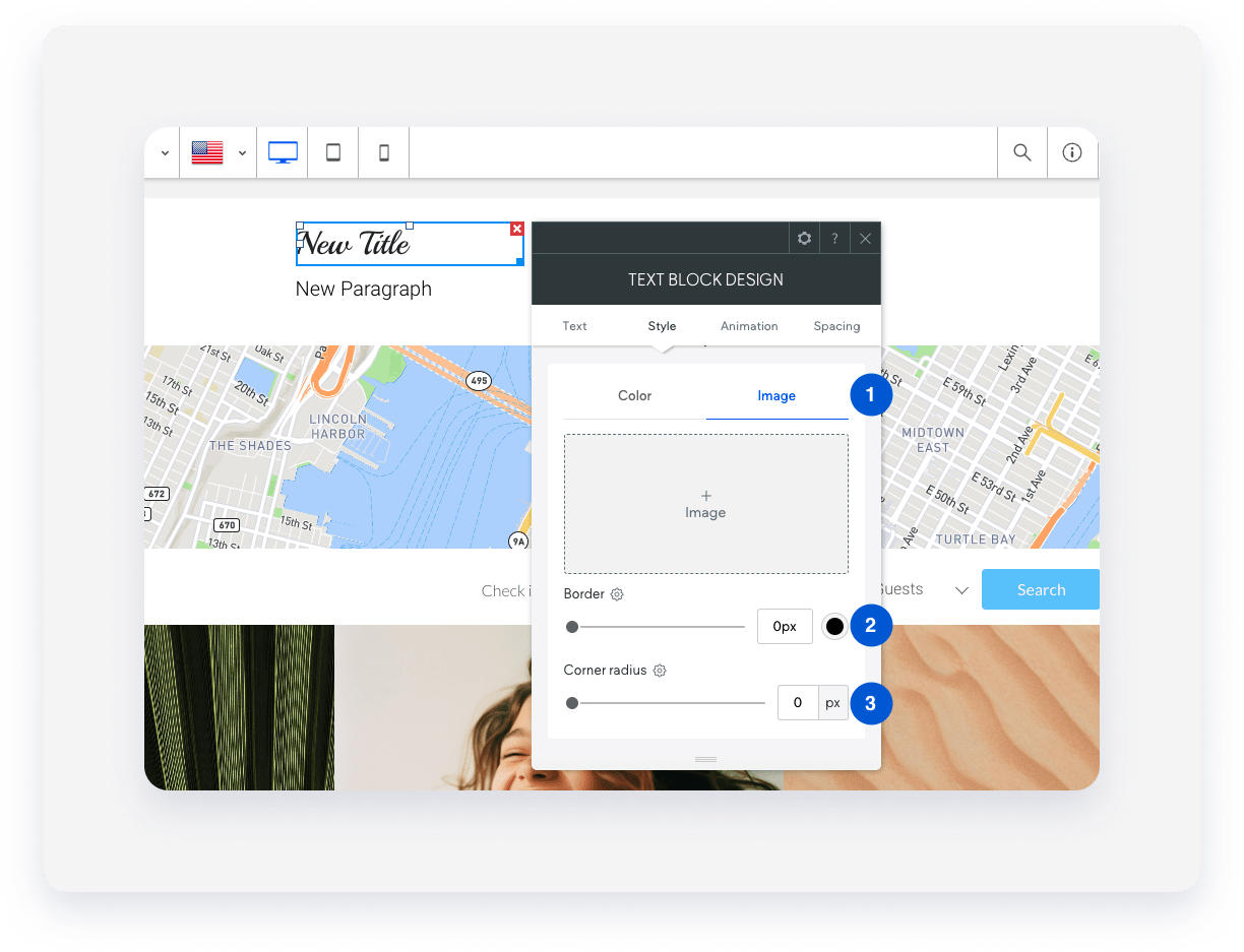
|
Number
|
Option
|
Description
|
|---|---|---|
|
1
|
Image
|
Open the image settings
|
|
2
|
(Image tab) Background image
|
Set a background image
|
|
3
|
(Image tab) Border style
|
Change the border style |