Flex is a mode for designing pixel perfect, responsive sections with additional design capabilities. Flex allows you to create and edit Guesty Websites quickly, while still using the building features from the classic editor you are already familiar with. Compared to the classic editor, flex offers auto layout, multiple element alignment and distribution, responsive size units, and more control over columns. This is what allows you to create and edit responsive designs more quickly than in the classic editor.
You can either add a flex section to an existing site, or create a new site using a flex template. If you use a flex template, all the sections are created with flex. The header is not made with flex and if you add a new page, store, blog, or membership page they will not be created with flex by default, but you can add flex sections to these pages.
Note:
This article is only relevant for users who started using Flex after July 18, 2022. If you are on Flex version 1.0, see Flex overview (1.0).
Flex terminology
The following provides definitions for terminology specifically related to Flex.
-
Flex mode. Where you create and edit flex sections. In flex mode, you have access to design capabilities that are not present in the classic editor, but you still have access to the building features of the classic editor.
-
Flex section. A row with default flex columns that create a layout. You can add, remove, or change the order of flex columns within a flex section. Flex sections can be saved as templates for future use.
-
Flex column. Where you add widgets. Flex columns have an auto layout, meaning the widgets inside are automatically aligned vertically or horizontally. Due to the auto layout you cannot move elements freely inside of a flex column, instead you have to use the alignment, spacing, and margin settings to move elements.
-
Vertical and horizontal flexboxes. A container that automatically aligns widgets within it vertically or horizontally. Due to the auto layout you cannot move elements freely inside of a vertical or horizontal flexbox, instead you have to use the alignment, spacing, and margin settings to move elements.
-
Advanced grid. Used to create free-form compositions or overlapping elements. The advanced grid does not provide auto layout or vertical alignment like flex columns. Due to this, we recommend you check your design on all breakpoints.
-
Breakpoint. Pixel ranges that correspond to the width of different devices, such as desktop, tablet, and mobile. When the width of a device is within a breakpoint’s predefined pixel range, the layout of the site is adjusted so the content and design is optimized for that device size and orientation.
-
Flex elements. An advanced grid or horizontal or vertical flexbox that is placed inside a flex column.
Hierarchy of elements
In flex mode, flex sections contain flex columns, and flex columns contain widgets. This is a default hierarchy, meaning you cannot add a widget to a flex section without having a flex column.
Select elements
There are several methods to select an element (flex section, flex column, or widget):
-
Hover over the element and click. When hovering over an element, look for the blue outline that indicates what element your click will select.
-
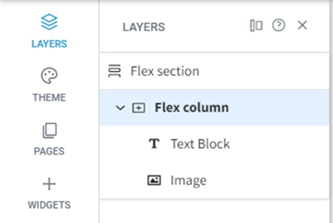
Select elements from layers panel. In the side panel, click Layers. From here, you can select any element from the selected section.
-
Select elements from design panel. Click the breadcrumbs in the design panel to select an element.
-
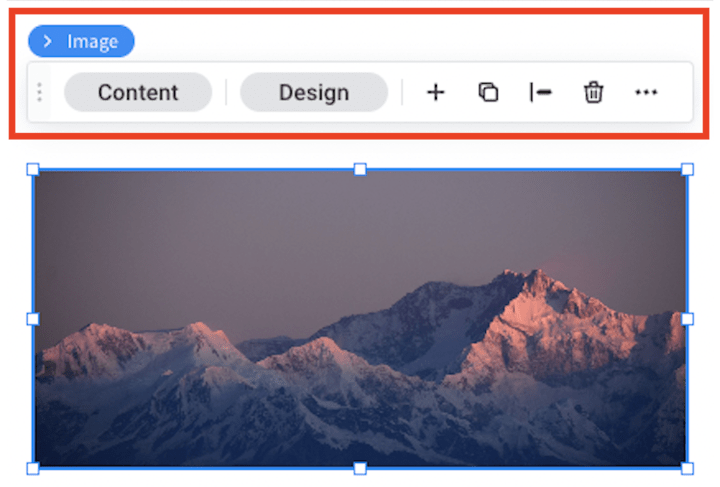
Select elements from the floating menu. If you already have an element selected, hover over the element name above the floating menu and a breadcrumb of flex elements will appear.

Flex mode
Layers panel
The layers panel displays on the left side of flex mode and shows the flex elements in the selected section. Elements are displayed according to their hierarchy, with sections as the top level. From the layers panel you can add new elements, select elements, rearrange elements, rename elements, and hide or show elements on certain breakpoints.

Design panel
The design panel displays on the right side of flex mode and contains your design controls for the selected element (flex section, flex column, or widget). The design options include layout, sizing, alignment, and more depending on the selected element.

Floating menu
The floating menu appears when you select an element. From the floating menu you can toggle between elements, add elements, open the content or design panels, duplicate the element, adjust alignment, delete the element, and more.

FAQs
What’s the difference between Flex and the classic editor?
Compared to the classic editor, Flex offers additional design capabilties that enable you to more quickly and easily create responsive sites. The following are design capabilities that Flex offers but the classic editor does not:
-
Save time. Flex is based on auto-layout, meaning the design is optimized to match any breakpoint.
-
Content alignment. Allows you to align all elements in a flex column at the same time. In the classic editor, you have to align each element individually.
-
Automatic alignment. Flex columns and flexboxes automatically align elements vertically or horizontally.
-
Number of columns. In flex mode you can add more than 4 columns to a section with up to 100% screen width.
-
Space between items. Allows you to set the space in between items once and it applies to all elements in a flex column.
-
Element sizing. Adjust element sizes to optimize for screen height in pixels and screen width in percentage.
-
Faster editing. With Flex advanced design capabilities you can edit an existing design much more quickly than in the classic editor.
What’s the difference between Flex version 1.0 and version 2.0?
Anything created with Flex before July 18, 2022, was created using Flex version 1.0. Templates or team sections created previously will continue to be edited using Flex version 1.0, but going forward newly created designs will use Flex version 2.0. If you are editing a template or team section created in Flex 1.0 there will be an indicator that reads Flex version 1.0 on the top bar, on the section name, and in the layers panel. After July 18, 2022 all new sites or sites that did not previously use flex are on Flex version 2.0 and cannot access Flex version 1.0.
Flex version 2.0 is more simplified and similar to the classic editor than version 1.0. Version 2.0 provides more predefined components so users can create and edit designs more quickly. Instead of using a grid to place objects on, users can now add columns which act as a layout to put widgets in. The columns provide the user with auto-layout, meaning objects will look great on each breakpoint without extra editing.
Limitations
Currently, you cannot add an additional language(s) to your site while in flex mode. You will need to exit flex mode first. To learn more about multi-language sites, see Configure a multi-language site.